
A Cross-Platform UX System for IOT Tools
Crafting Consistency: The 0-1 Journey of Building a Design System


Project Background
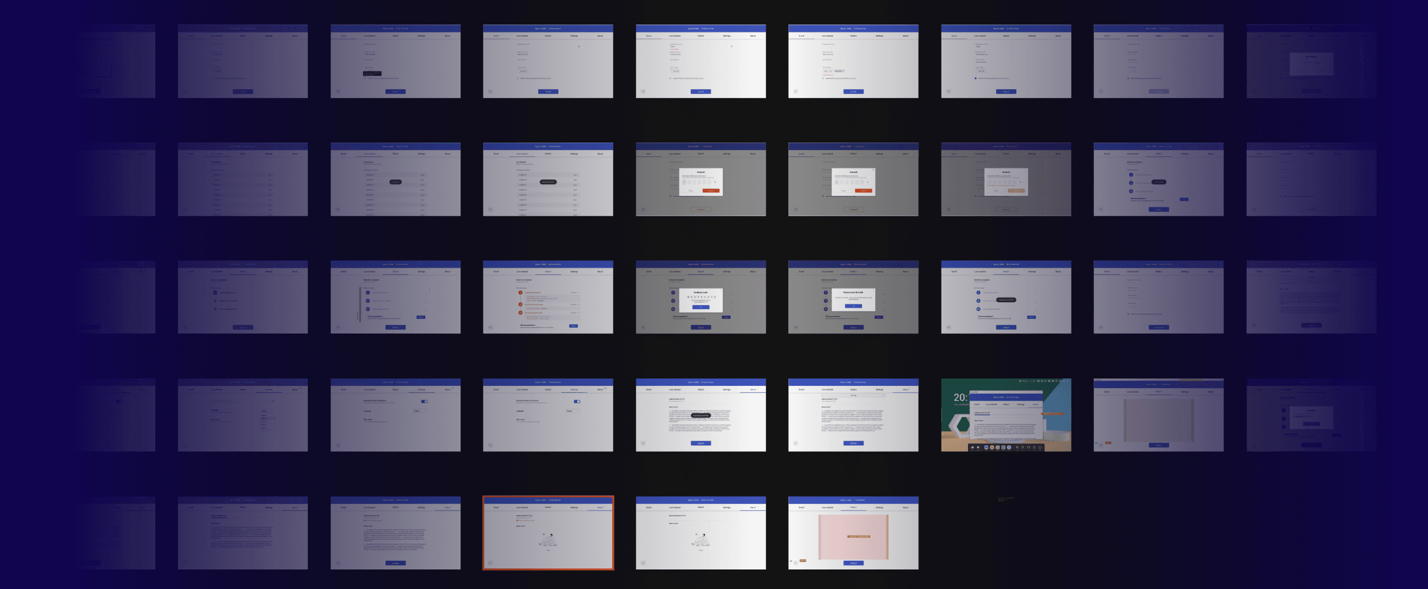
As the product scaled, we faced growing challenges: inconsistent UI patterns, duplicated components across teams, and inefficient handoffs between designers and developers. I led building a new design system for a remote device management system (Bytello DMS) that could ensure consistency across platforms, improve team efficiency.
Product
Role
UX design Lead
Responsibility
Publish documentation and educational material, Usage guideline, 0-1 building, Drive adoption
Duration
2 months
WHY build a design system at that moment?
BUSINESS
We opened the ODM (Original Design Manufacturer) business.
→
Supporting UI customization
TEAM
Team expansion increases collaboration complexity
→
Onboarding new member
DEVELOPMENT
Redundant work slows down development
→
Reducing redundant developer work
Challenges
To identify key challenges, I reviewed 13+ design files , compared them against the launched products, and conducted discussions with designers, developers, and product managers.
01
Inconsistent Cross-Platform Experience
02
Lack of Responsive Design
03
Inefficient Collaboration in Design & Development
Results
70% Fewer Visual Bugs
🧑💻 Visual bugs per release dropped from over 100 to fewer than 30 after system adoption
15% Faster Delivery
🧑💻 Component reuse accelerated development speed by 15%, reducing launch delays
01 Inconsistent Cross-Platform Experience
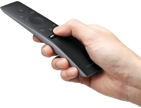
When Screen Size and Interaction Break Consistency
Different devices come with different features, like screen sizes, interaction methods, and user habits. Instead of forcing pixel & interaction consistency perfection, we need an approach to maintain a cohesive experience.
14“ Laptop
75“ Smart board

Macbook Air

Solution 1
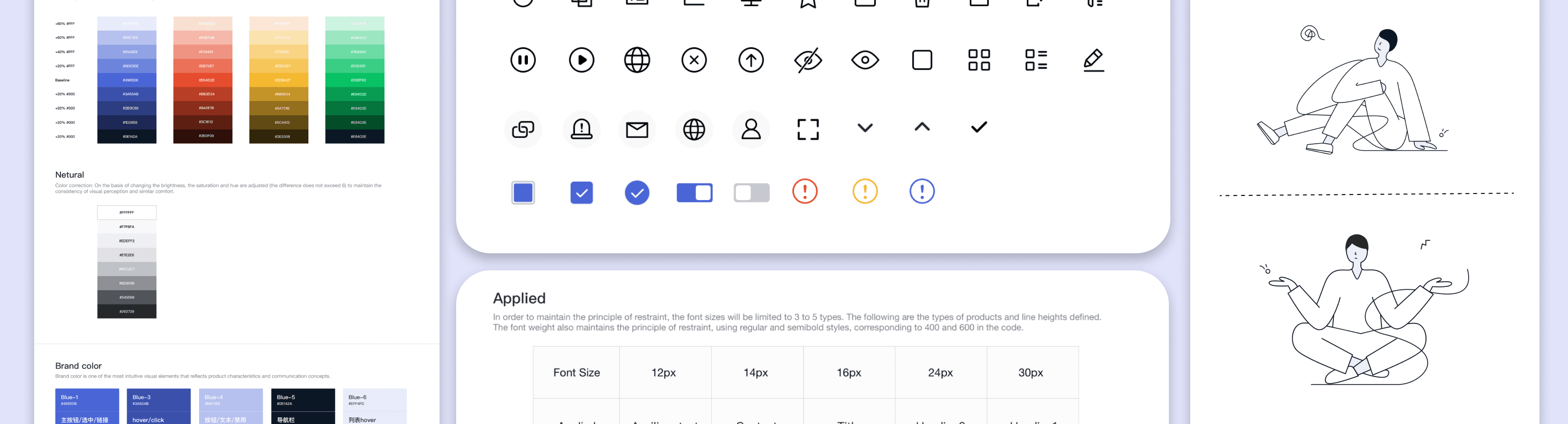
Building a adaptive visual language system keeping consistency
Standardized color, typography, illustration, iconography, and animation to ensure a cohesive experience across laptop, smartboard platforms.


Color

Illustration
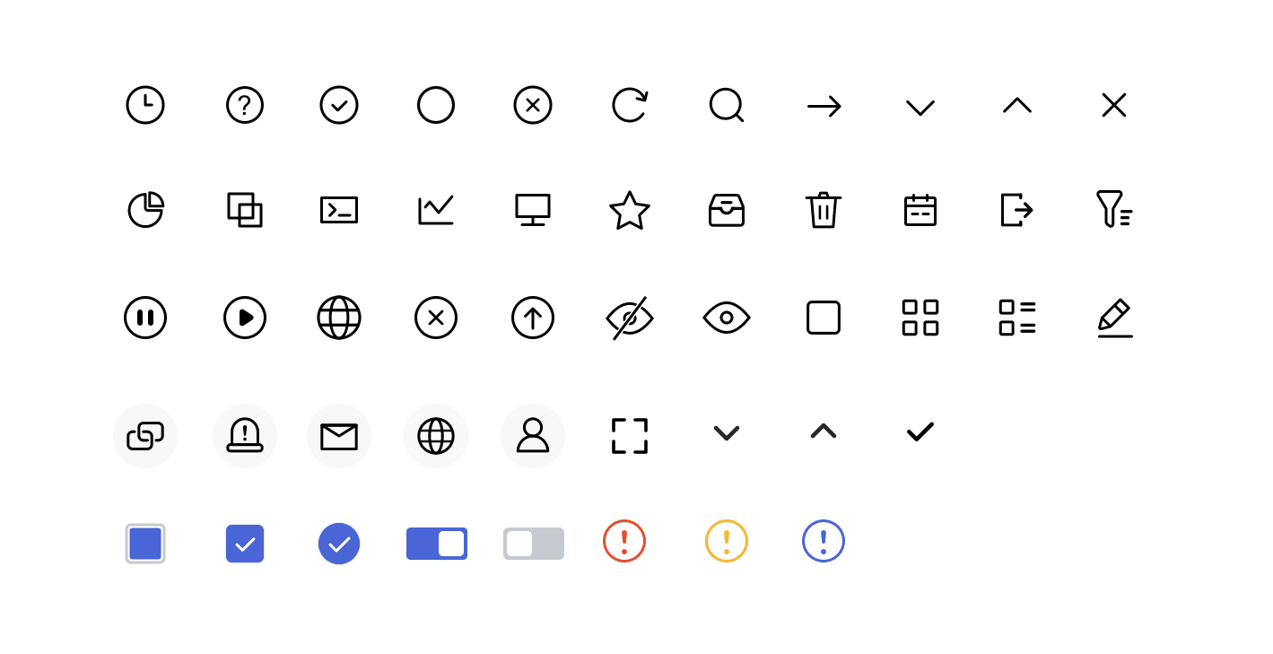
Icon

Animation

Aa
Font
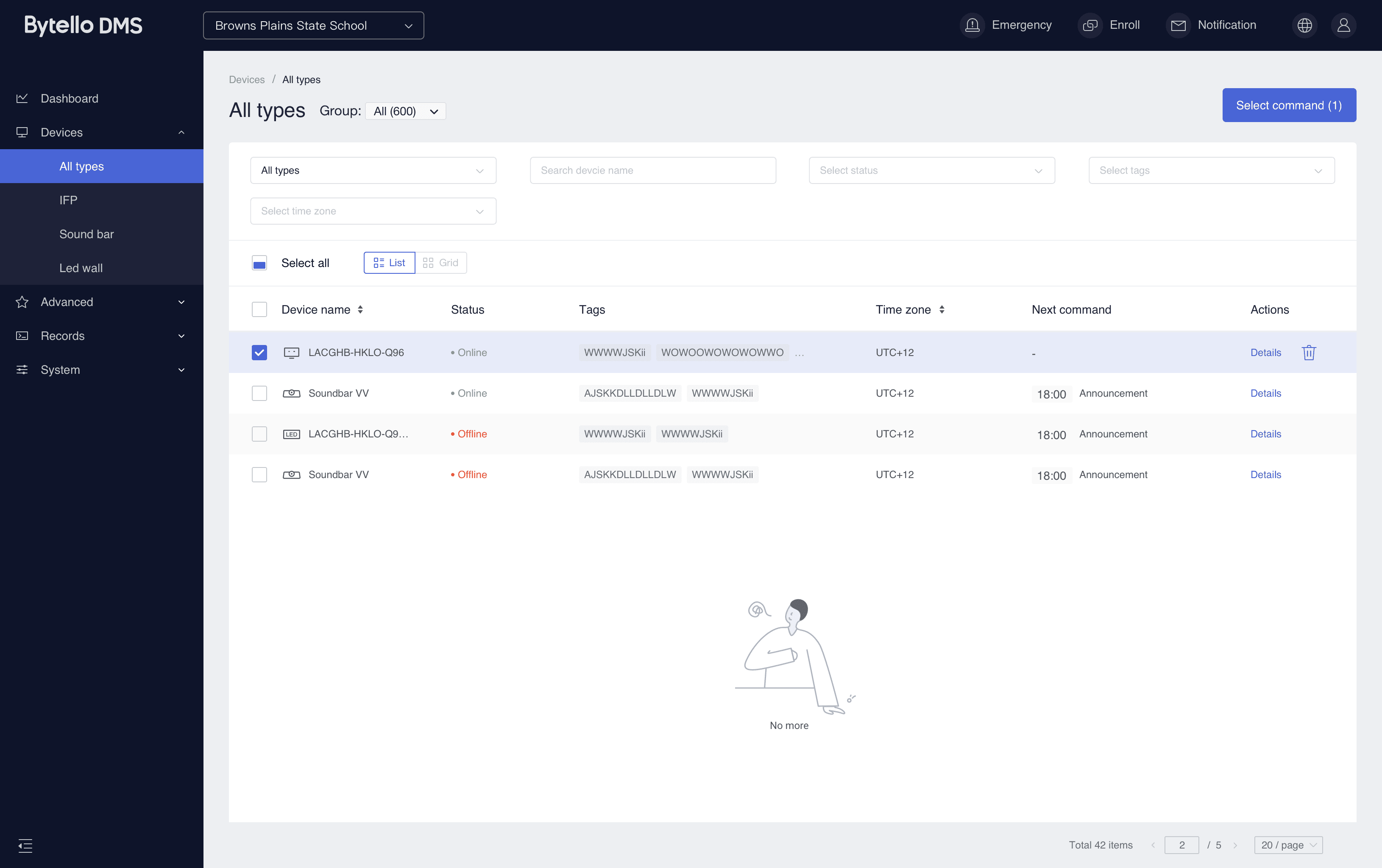
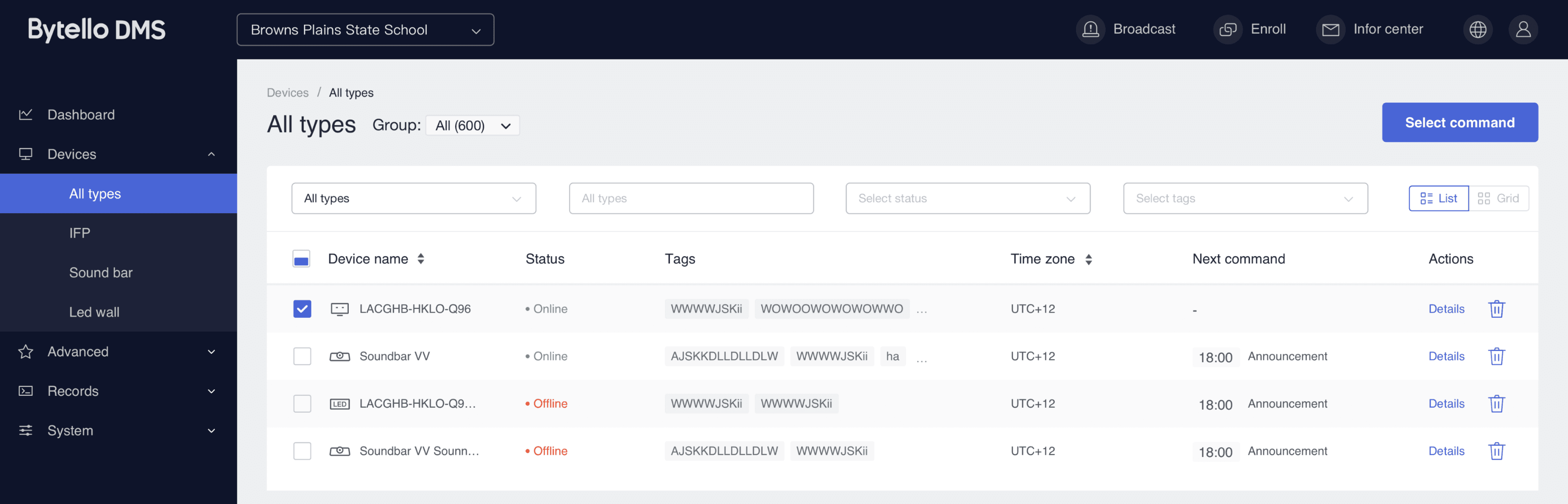
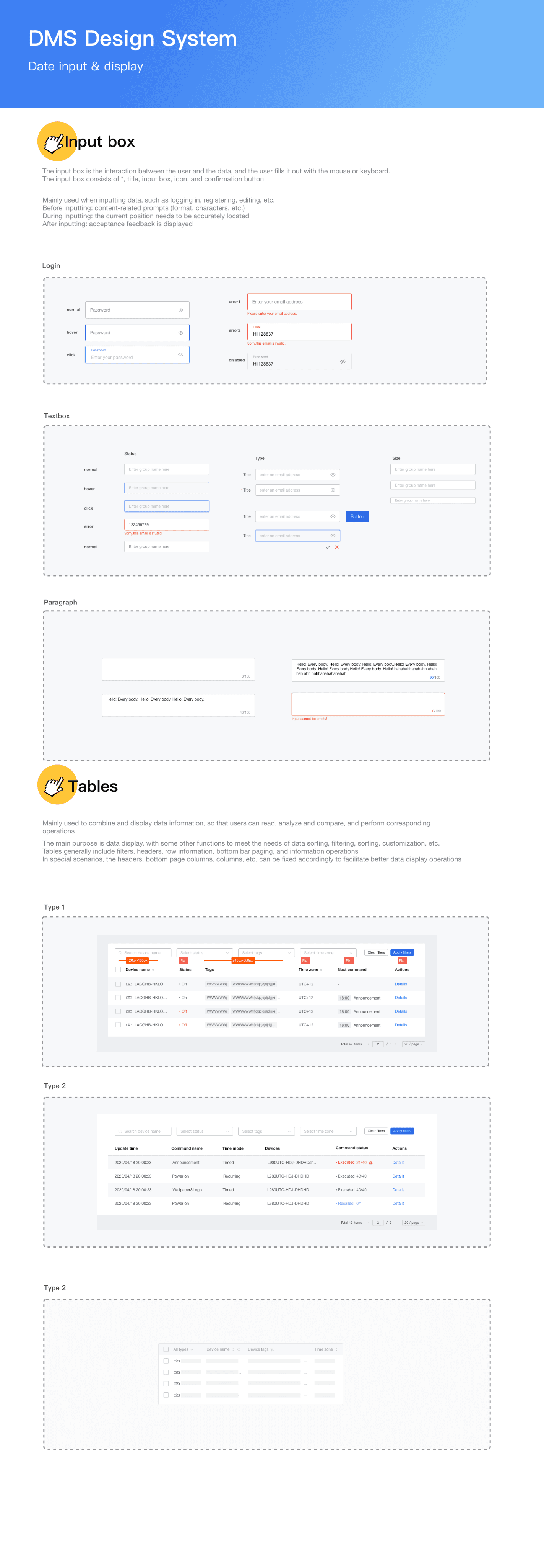
02 Lack of Responsive Design
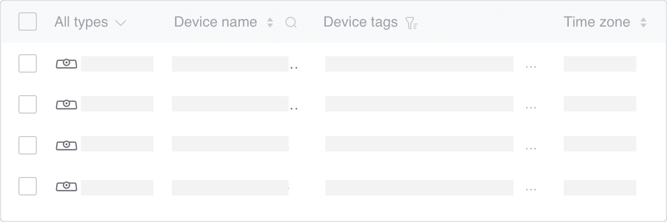
Complex tables often break layout on smaller screens
Rigid layout
Select command
Column Overcrowding

Fixed column
80px
Inconsistent table pattern
Pro Table
Small Table
Solution 2
A responsive framework to make complex tables usable
We established a responsive table framework to ensure consistency across large and small tables by defining fixed widths, stretch ranges, and display rules.
03 Inefficient Collaboration in Design & Development
Fragmented Development and Redundant Work
Inconsistency everywhere


Details*
Submit
99+
Table A and Table B have different interactions—Table A allows click outside to dismiss, while Table B requires button action. Please update Table B to align with Table B.
Additionally, there are UI inconsistencies in shadow, modal size, and position.
Communicated with developer found:
modals were being developed independently by different engineers, without a shared guideline.
Hey, 👋 I noticed that this modal behaves differently from the one on the homepage.
Also the close button is missing, and the way it opens feels different.
Designer
Oh, I didn’t actually build this one. This modal belongs to another feature, and a different developer worked on that page
Developer

Got it. So there’s no shared component for modals? ...
Designer
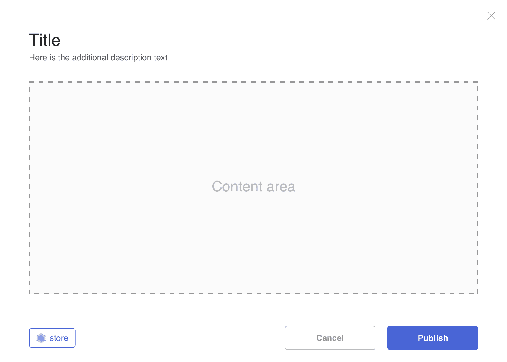
Solution 3
Unified modal dialogs components:
Listing all Modal Types → Ensured uniform behaviors for opening, closing, and user actions → Implemented a shared modal component for every developer
Modal - small
Message
Modal - big
Drawer


Final deliver
I spent nearly two months independently exploring and building the first vision design system, marking my first time fully leading such a project.
The entire design process was driven by design value and time constraints. I started by defining visual design principles and interaction guidelines based on our product’s user persona. Then, I modularized key elements into components, ensuring flexibility and customizability for B2B product design.
Design principle

Fear of Making Mistakes
Accuracy
Complex & Overwhelming info
Efficiency
Inconsistencies between different devices
Consistency
Based on spatial model
1
L1
L2
L3
L4
Popup
Top menu
Side menu
Content / Tables
2
3
4
Atomic design principles
I applied atomic design principles by breaking down fundamental elements like typography, colors, icons, and buttons into atomic units. This atomic approach ensures scalability and consistency, making it easier to build standardized components and streamline future design specifications.


Molecules & Organisms design
I applied Molecules & Organisms design principles by combining atomic elements into functional components like input fields, lists, etc. And further assembling them into complex UI structures such as forms, navigation bars, and modals (Organisms).
Created template 50+
I created more than 50 templates for the control and controlled ends of the product, which can be quickly reused in specific scenarios to enhance efficiency and consistency.
Key Takeaway
🧑🎨 Building from Scratch
Independently developed the 0.1 vision of a design system, gaining hands-on experience in structuring and scaling a foundational design framework
📑 Atomic to Organisms Approach
By applying this method, I gained a deeper understanding of interface composition—realizing that all info structures are basically built upon contrast, alignment, repetition, and proximity, reinforcing clarity and usability in design.
🧑🎨 Scalability & Reusability
When organizing the B2B design system, scalability of information and reusability in development were my main goals. Many UX patterns were “similar” but never considered for reuse, leading to redundant work and higher cognitive load for users.
👄 Cross-Functional Collaboration
Although organizing the component library—sorting through 13 versions, refining details, and replacing inconsistencies—was tedious, TBH I wanted to give up many times. Finally I mad it, so proud of myself 🎉
Reference
Thanks a lot!